Lego Store
8th task of Russian Design Cup 2012
First, I figured out width breakpoints: 240-319px, 320px, 640px, 768px, 1000px и 1200px.
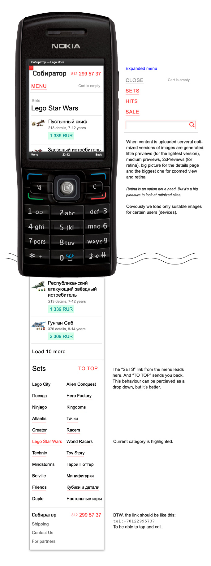
240 — 319px
The lightest version. For small screens and DPIs. And often it is about very slow connections and low performance.
Important! For this, next (320–639) and full version different CSS files should be used and downloaded only on purpose according to corresponding @media-queries. It is an optimization for mobile users not to download unnecessary data. Each CSS contains the minimum required for the current user. We also have a special set of small lightweight thumbnails of goods photos.
In this case study listed screens show the all same page: Lego Star Wars Series.
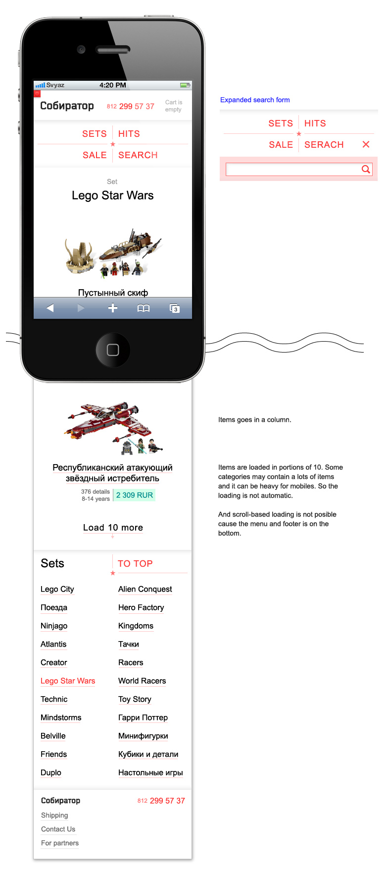
320 — 639px
Layout for average smartphones in portrait mode (2012). Modifications are obvious. Fonts get bigger, everything get wider. Goods and menu are centered. Pictures should not be small — store is designed not for pageviews, but to give customers the shortest way to choose and purchase.
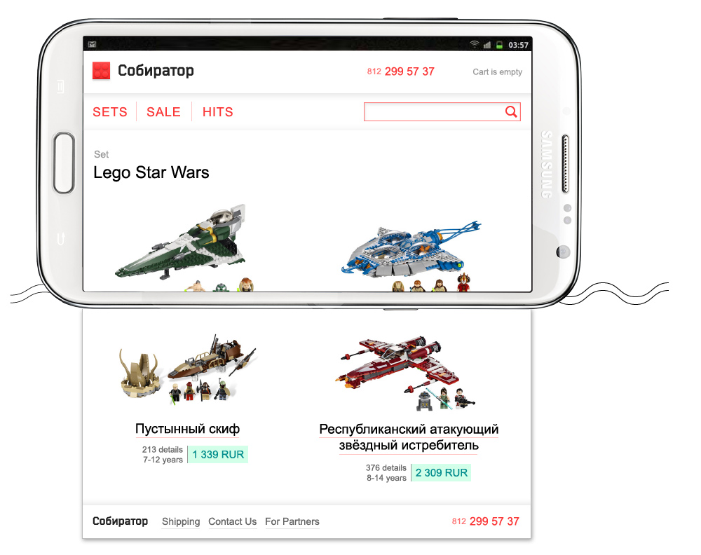
640 — 767px
Third CSS is engaged here. Starting from 640px items lay in two columns. Header just spreads horizontally. We can even show the full logo now! Menu becomes inlined. Search field reveals for instant access. Footer's two columns split in four. Increased font sizes and more whitespace.
This range was for small tablets and some of the smartphones landscaped.
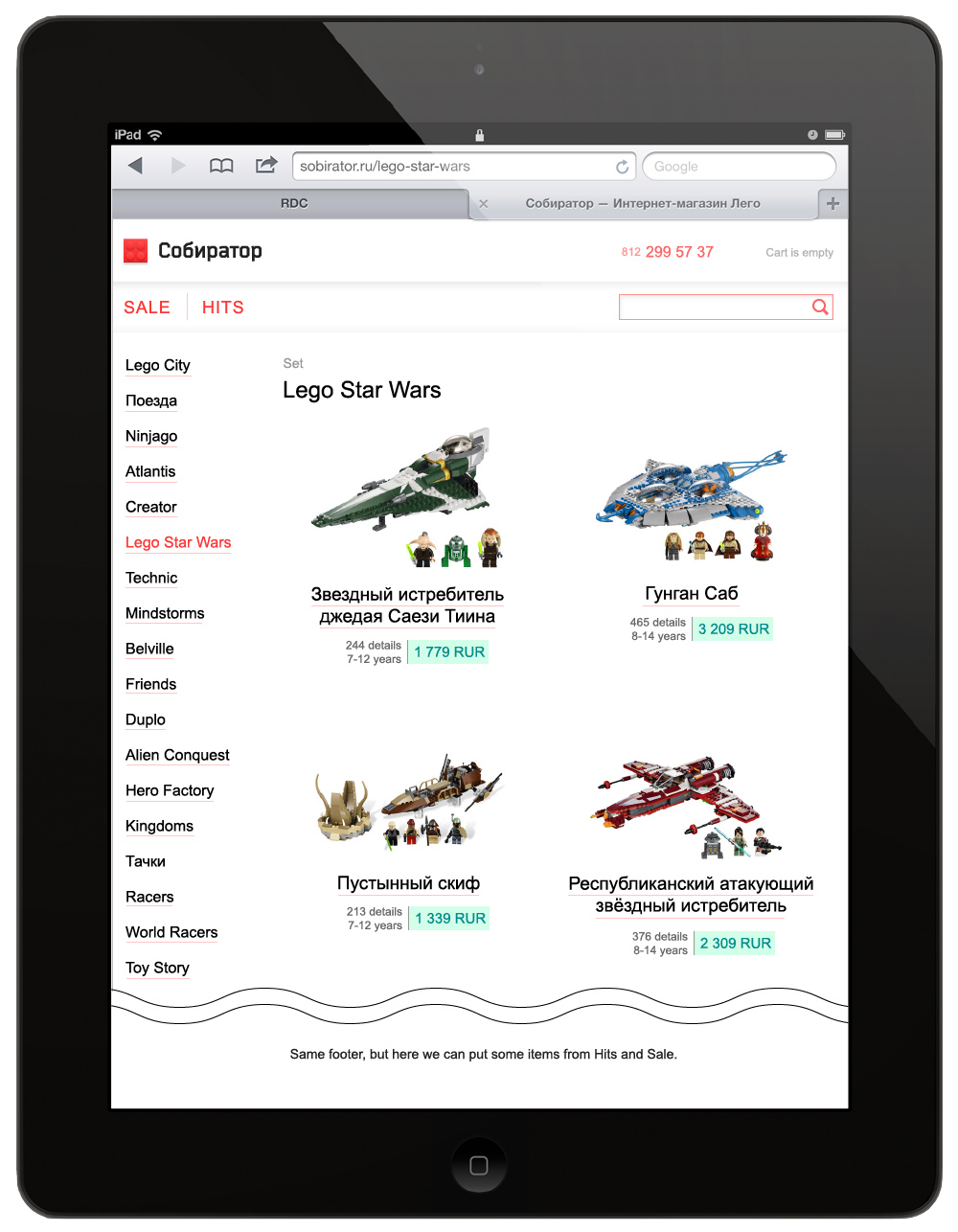
768 — 999px
Further horizontal spread, pretty clear. Now when there is spare width we can expand "Series" in a common left column.
1000 — 1199px
Statistically here are average desktop and laptop users + some tablets in landscape mode. 1000px breakpoint can be debatable but as far as we build responsive layouts it is comfortable on any resolution.
Further we stop stretching the layout on every pixel — no need for that on big screens. Or stretching can even spoil experience for the users who use browsers in fullscreen mode on big displays.
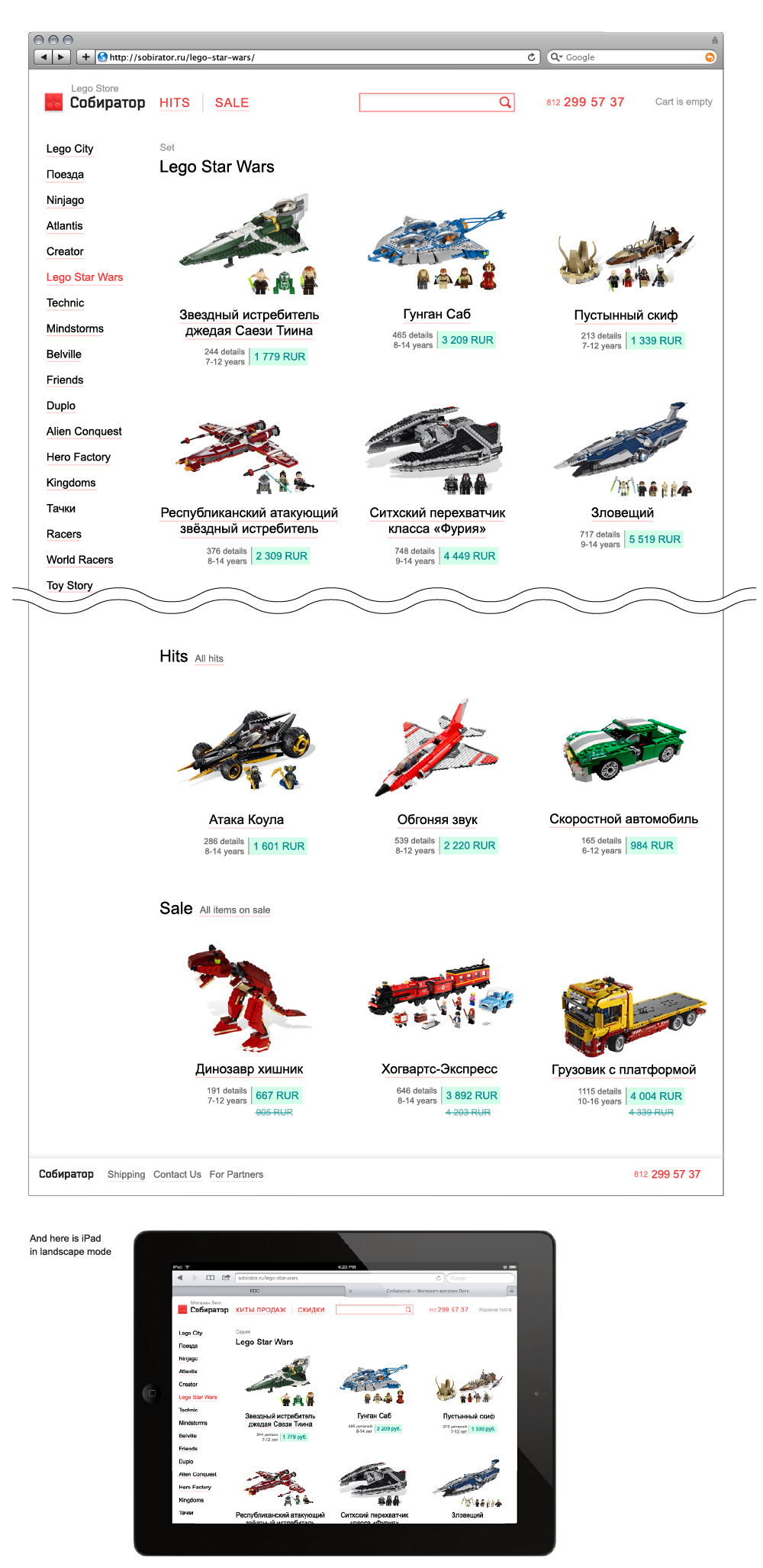
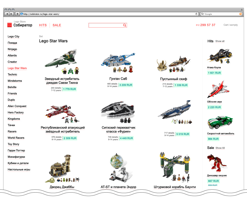
1200px and more
Last breakpoint. Moving recomended items in it's own new column on the right. Adding more whitespace.
And that's it.